Mobile first: your company site on a phone
Most of your visitors open your site on their phone, and Google itself looks at the mobile version first. What does designing a site mobile-first actually mean?
Watch yourself the next time you look for a company or a service: you probably do it on your phone, on the way somewhere, during a short break or at home in the evening. Your customers do the same. Yet many sites are still designed on a large monitor in the company office, and then someone asks for them to be “fixed for mobile”. The result is small text that needs zooming, buttons crammed together, menus that will not open and slow pages. Mobile-first thinking reverses that order: start from the phone, because that is where most customers meet your site.
Why now?
Two reasons make mobile first a necessity rather than a choice. The first is customer behaviour: social media ads, links in messages and search results are mostly opened on phones. The second is search engines: Google has announced that it mainly uses the mobile version of a site to index and rank it. In other words, what Google sees of your site is what appears on a phone; if the mobile version is incomplete or awkward, your whole search visibility is affected.
Five moments that decide if a visitor reaches out
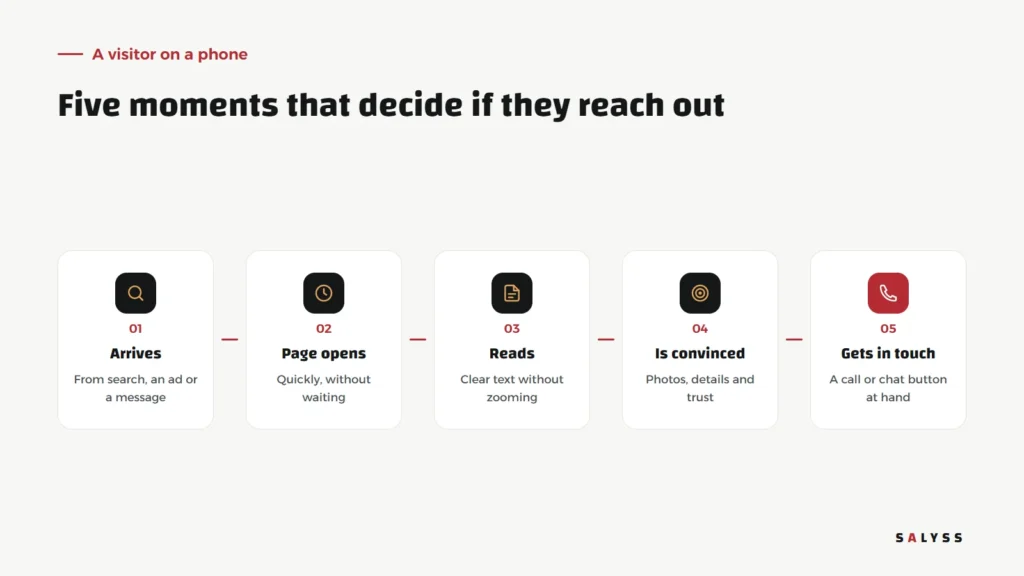
The visitor arrives from a search, an ad or a message. The first test is how fast the page opens; people on phones are impatient, and often on mobile data rather than office Wi-Fi. Then they try to read: is the text clear without zooming? Do they understand what the company offers from the first screen? Then they look for what convinces them: real photos, details, signs of trust. Finally they want to get in touch: a call or chat button within thumb’s reach, or a short form that does not ask for ten fields. A stumble at any of these moments may mean a visitor who went to your competitor.
Six points to check on your site
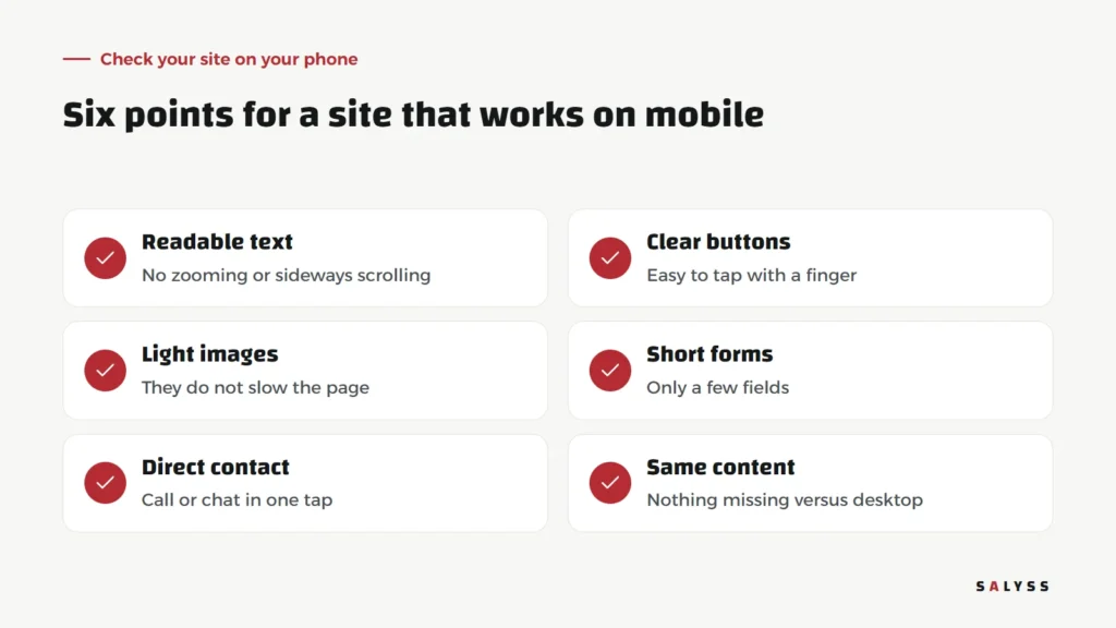
Readable text
A font size you can read without zooming, lines that are not too long, and no sideways scrolling.
Clear buttons
Buttons big enough to tap with a finger, with enough space between them to prevent mis-taps.
Light images
Images sized and formatted for phones so they do not slow the page. We covered this in detail in website speed: why you are losing visitors.
Short forms
Ask for the least you need to get in touch: name, phone and perhaps one question. Every extra field on a phone is an obstacle.
Direct contact
Visible call and chat buttons that work in a single tap.
The same content
Do not hide important content on mobile to make it look simpler. What customers need and what Google reads should be there on the phone.
Mistakes we see often
- A pop-up covering the whole screen as soon as the page opens.
- Wide tables that need sideways scrolling to read.
- A long main menu where it is hard to find what you need.
- Phone numbers written as an image that cannot be tapped to call.
- Autoplaying video that eats the visitor’s data.
How do we build mobile first?
On the sites we build, we review every page on a phone before the desktop. In the SALYSS Builder Pro page builder, the company’s team sees a preview for each device before publishing any change, so nobody discovers after publishing that a new section looks broken on phones. And we have learned that the best test is not a technical tool: hand your phone to someone outside the company, ask them to find a piece of information and contact you, and watch where they hesitate.
Landing pages and ads
If you pay for social media ads, most people who click them open the page on their phone. A landing page that is slow or awkward on mobile means paying for visits that never become customers. See a landing page that turns visitors into customers for what that page should contain.
Not just the website
Mobile-first thinking does not stop at the public site. Your own team works from phones more than you might think: a sales rep logging a visit from a project site, an engineer uploading a photo from the field, a manager checking today’s figures on the way home. Internal systems that work poorly on phones push the team to postpone logging until they are back at the office, so details get lost or never recorded. That is why we build the screens field teams use to work on phones first, as we explained in a sales and collections team app.
How do you know the improvement worked?
Watch what mobile visitors do after the change: do they stay longer? Do they reach the contact page? Do enquiries from phones increase? Standard analytics tools separate mobile from desktop visits, so compare the periods before and after the change, and let the real numbers tell you what worked.
Where to start
Open your site on your phone now and try to find your services and contact the company with one hand. Write down everything that slowed or confused you; that is your first improvement list. Explore SALYSS Platform (page in Arabic), or book a free consultation to review your site together.
Frequently asked questions
What does mobile first mean?
Starting a site’s design and testing from the phone screen and then expanding to desktop, instead of designing for desktop and trying to squeeze it onto a small screen.
Does Google care about the mobile version?
Yes. Google has announced that it mainly uses the mobile version of a site for indexing and ranking, so the mobile version should not have less content than the desktop one.
How do I test my site on mobile?
Open it on your phone and on different phones, and try to find information and contact the company with one hand. Whatever is hard for you will be hard for your customers.